Why Are Companies Changing Their Logos
Company logos are obviously important for any business. And that's why most people spend a lot of money and time to create a timeless one for their brand. But that doesn't mean your logo can't be changed. In fact, you have to keep up with the trends. Speaking of which, you might have noticed how flat design in logos dominate the market today. Let's talk about these flat logo designs and why it is beneficial for your business.
What is Flat Design?
Flat designs are two-dimensional design styles that are perceived to be simpler and cleaner. According to the Interaction Design Foundation, it became popular when giant companies like Microsoft, Apple, and Google started using flat design. In fact, they even changed their company logo.
Evolution of Company Logo Designs
Have you ever wondered about the history of company logos and how it grew over time? Here's a rundown:
Identifying Marks
For centuries, people have been using symbols, images, and even signatures to identify themselves. Think about the markings in caves or the signatures on paintings. But then, various industries came into the picture and the business owners needed symbols that will make them well known. Hence, the birth of company logos.
Flat Designs Before Digital Age
Before the emergence of computers and design software, flat designs are widely used for a good reason. You see, logos are printed on different items or merchandise. The printers back then were considered primitive. A complicated design will be harder to execute.
Birth of Skeuomorphic Design
And then advanced technology happened and design styles changed as well. Computers paved the way for graphic designers to create more complex company logos. They call it skeuomorphic design or designs wherein the objects try to replicate its actual counterpart. For example, you're working on an icon for books. Instead of a two-dimensional image, you will create a 3-D design that looks almost realistic.
This trend happened simply because there was the technology to use. Graphic designers naturally wanted to showcase their skills as well. Plus, the market is already changing. They want something fresh or futuristic at that time. These skeuomorphic designs send signals that a company is modern, fast-moving, or up to date. Lastly, printers already upgraded and you can print more complex designs practically on everything.
Going Back to Flat Designs
Right now, flat designs are back – and it's not because we lost all the technology.
There are different reasons why flat designs are back. Some say that people are already tired of seeing realistic images. Others believe it's because of influence. We will discuss the other reasons in the next section of this article.
Like fashion, logo design trends keep coming back and you have to be on the lookout for what works best. You have to change it – or risk losing massive business opportunities. That trend will likely be the same in the next years so you might need to work on your company logo. Penji team has professional graphic designers to help you.
Why Use Flat Logo Designs
Are you still using the old version of your logo? If you are not convinced that it has to change to a flat design, here are the reasons that might change your mind.
It's What the Market Wants
If you are running a business, it is essential that you understand what your market wants. That's where you will base all your points for improvement. And we are not just talking about altering your products and services. Even your logos and other marketing materials must level with your audience. In this case, flat design is generally what people like today.
Less Cluttered
Let's admit it, most of us are geared towards minimalism. We want everything clean, crisp, and classy. Most of us would rather choose function over aesthetics. And that's what flat logo designs convey.
It Looks Better on Screen
The bulk of the market uses smartphones or tablets. Having said that, simpler designs look way better on screens. And that's why flat logo designs are good. You want people to remember as much detail as they can from your logo. This is an effective strategy if you want to address brand recall.
In addition, flat logo designs are more flexible. You can easily scale it depending on your needs.
It's Easier to Execute
Since flat designs require lesser elements, these are generally easy to create. This leaves our graphic designers to think better and do more. Please take note though that the brainstorming process should not be compromised. A simpler design doesn't mean a blander idea. In fact, they say that 'simplicity is genius '.
If you have an existing logo, then it would be easier to transform it into a flat design. But if you will start from scratch, your team needs to identify your brand's core design first. What would be the symbol? What message would you like to amplify? And what colors will work best? From there, your graphic designer from Penji can play with elements and provide you with the best flat logo design.
Companies That Changed Their Logo to Flat Design
Again, logos can be altered. That's already an established fact and is proven by the big players. Below is a quick list of organizations that changed their company logo over time. To date, they have a flat logo design to fit the trend and the current market. The question is, why are you not doing it?
Nike
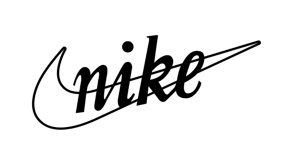
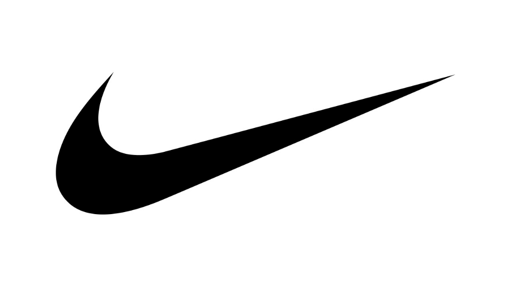
Take, for example, Nike. For years they have changed the font and color. But one thing remains the same- it's their iconic 'swoosh'. It was already a flat design, to begin with. But again, graphic designers know when to remove elements to please the market.
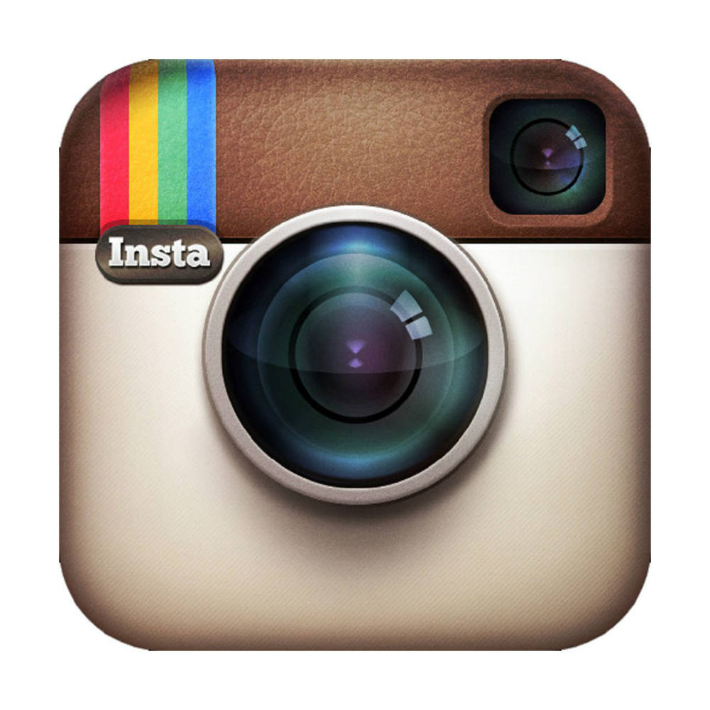
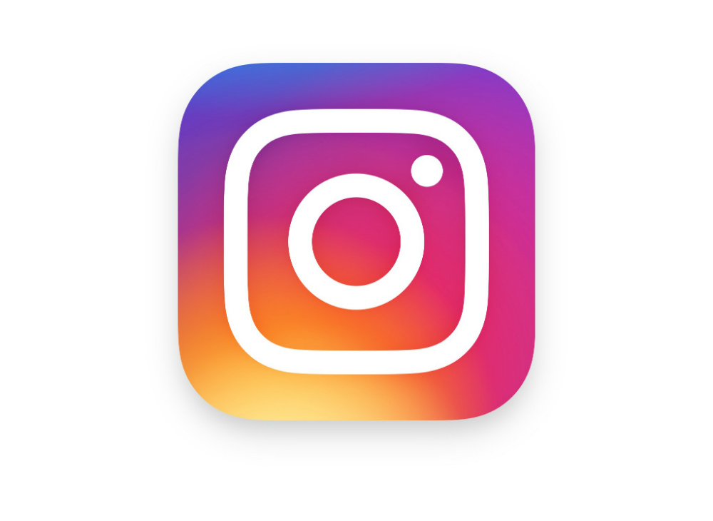
Can you still remember the old Instagram logo? It's the image of an old camera with small rainbow stripes on the side. It was beautiful, iconic to say the least, but the company had to change it to simpler flat logo design. According to Instagram, It was said that the design reflects how the app changed over the years. If you must know, Instagram used to be an app where you can edit your photos to look vintage. It wasn't the social media giant as we know right now.
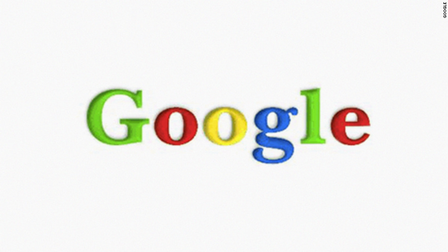
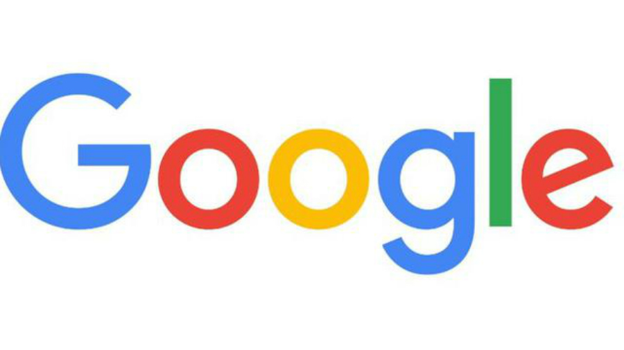
Some people might ask, why does Google need to change its logo? Isn't it already a tech juggernaut that doesn't need to prove anything? Well, the company answered it and their response is quite profound.
As a company, they understand that more people use their services on different devices. They want their logo to accommodate the demand. And that's why they created a logo that is simpler so that everyone can read it – even those who are using a small screen.
Conclusion
We are not saying that flat designs will be here forever. In fact, it can change, the same way our taste and preference change. Thus, it's safe to say that your company logo must have a core element or symbol first. That's where you can base your flat design. And if you need help, don't forget to call graphic designers to create a timeless company logo for you. Penji is one of the best teams that offer the most reasonable packages.
Updated June 12, 2020

About the author
Barbara Anne Isla BA Isla is a Content Writer and also an Events Host. She left the corporate world to do what she loves and to spend more time with her amazing kids. She hopes to bring valuable change to society with her words.
Why Are Companies Changing Their Logos
Source: https://penji.co/flat-design/
Posted by: olsonacien1935.blogspot.com

0 Response to "Why Are Companies Changing Their Logos"
Post a Comment